Some of you who read the blog regularly or bump into me at shows know that I absolutely love Fantasy models. I adore Unicorns, Pegasi, Alicorns, Thestrals, Hypogriffs, aaaaand...
Hippocamps. I may have a slight obsession with Hippocamps.
Last year, I ordered myself one of the first ten Hippocampus sculptures produced by Melody Pena of Windstone Editions, and I painted him a lovely silver dapple bay. Even though he's a sales piece, he's still one of my favorites.
 |
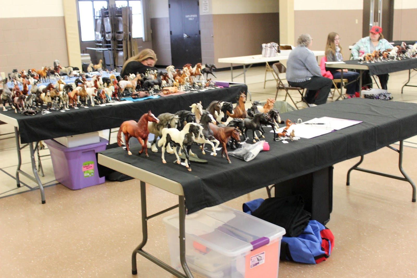
| He totally ROCKED the Stone Age Live show in July! |
But I wanted to take the mold again and do something totally different with it. If I could, I would just hoard Hippocampus molds, but because of how much I show, that seems a little impractical. So, I wasn't about to repaint over this handsome boy, but I didn't want to buy one either until I sold him.
 |
| Some "glamour shots" of Pisces! |
Lucky me, though, because I ended up with another blank Hippocampus mold for Christmas - thank you, Mom!
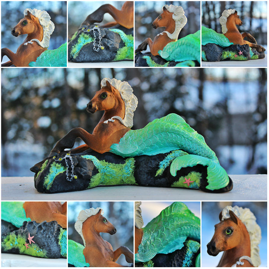
I took a little time to do some research and work from the bottom - up, so I started off researching what kind of fish I wanted this new guy to be. After a lot of thinking, I went with the Sanke Koi fish.
 |
| Gorgeous - and look at those eyes! |
Koi fish are absolutely gorgeous! I just adore the red orange color with black spots mixed in, and I thought that it would make not only for a really interesting tail pattern, but that I could also translate it over into a horse color pattern rather easily. One of my favorite patterns, to be exact.
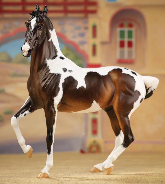
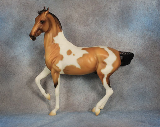
Another thing is that if you know me real well, you also know that I'm a total sucker for chestnut pintos. Or just RED pintos, in general- chestnut, sorrel, red dun, etc.
 |
| Maybe it's because I own one? ;) |
 |
| But, seriously, what about this isn't totally breathtaking? |
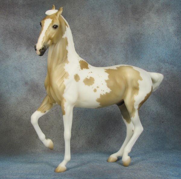
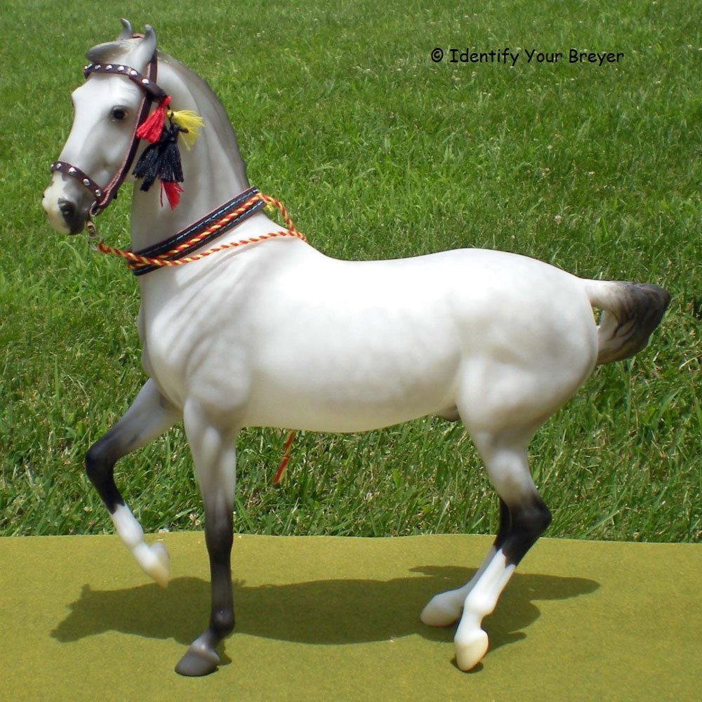
I'm also absolutely in love with Medicine Hat pintos. If you've never heard of a Medicine Hat, they're pintos of any color that have a distinct "war bonnet" on their head, covering their ears. They're considered sacred to some Native American tribes, and actually, the less color, the better! The most sacred horses were those who were all white except for the bonnet. A lot of Medicine Hats also have a "shield" marking covering their chest.
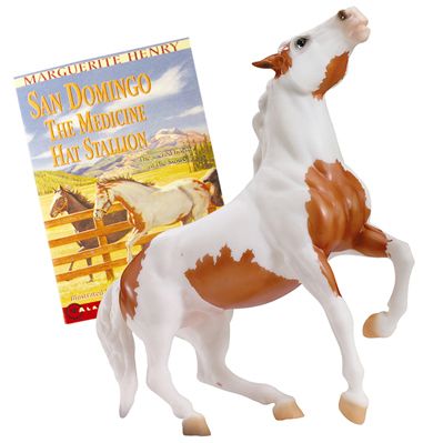
Why am I so attached to Medicine Hats? Well, one of my very first Breyers was this guy right here:
 |
| The 2007 re-release of San Domingo, paired with Marguerite Henry's book of the same name. |
My mother got him for me one year for my birthday (can't remember exactly how old I was... I believe I had just turned nine,) and I have been super attached to him ever since. He's not my favorite mold, and he's certainly not my favorite paint job, but he is a model that I will likely never part with because of sentimental value. I used to take him everywhere with me when I was a kid.
And back to the Hippocampus!
I don't have set in stone color recipes for when I do horses, so the base color for this guy was more or less an experiment. At one point, he was actually a very, very bright yellow before I began adding in the browns and oranges.
 |
| The guy on the left is another work in progress - I figured while I had paint mixed, I would work on two ponies! |
I made sure to add just a little bit of metallic gold paint to my mixture when I was working, so both of these two have a very slight metallic sheen to them. It's not enough to be obnoxious, but it does give them some lovely sparkle in the light.
After the base coat was completed and he was matte sprayed for the first time, I began to add the white markings.
You can see here that the first layer of white markings seems a bit patchy and chalky. I actually began on this guy using Earth Pigments, which are natural colored powders that you mix with water to create a paste you can paint with. When it comes to mapping out basic patterns on a horse, I think it's the easiest medium to work with. It goes on smooth and comes off easy with a paint eraser or even a Q-tip. You have to be careful not to rub too hard to remove the pigments, though, because it could damage the paint underneath.
After the first few layers were laid down with Earth Pigments, I started with the white acrylic paint to make the markings brighter and a bit more crisp.
In these pictures, I've just gone over his markings with acrylics, leaving the areas around his smaller spots more faint to show that the spots are mapped. With each layer, I stay further away from the edges of his markings, which creates that mapping around the larger spots. The acrylics have also continued onto his tail to give a base for the Koi spots I'll add in after this.
I've left the patch over his withers and onto the beginning of his tail that chestnut color so that I can make his tail blend smoothly into his horse half.
In the second photo, his Koi spots are complete! After waiting for them to dry, I go back in with iridescent paint, which helps to create a more wet and "fishy" look to his scales and fins.
You can see that the iridescent paint adds a bit more definition to the scales and fin. Koi fish also don't typically have spots on their fins, so after this touching up those areas is essential. I had to go in with a very tiny brush to make sure that when I painted his fins, I did not get paint onto the colored spots I had just finished.
Moving onto bigger and better things - with his body completed, it was time to start working on his base. With Pisces, I made the rock underneath him dark to provide contrast for the blue-green tail. But I didn't feel like that was the right choice for Mr. Sanke here. I looked around for some reference pictures of Koi ponds, and I found that a lot of the rocks around the edges are typically a grayish-tan color, so that's what I decided on.
I also began to add color to his tentacle mane at this point. It almost came down to a coin toss to decide whether he was going to be a flaxen or a red chestnut, but I went with the plain red chestnut because it seemed to fit the Koi-ness better.
At this point, with everything fully painted, I went in and added some shading with pastels. Pink pastels were added to his elbow-fins, pasterns, muzzle, fetlocks, dorsal fin, pectoral fins, tail, tentacle, and around his left eye - essentially, whatever areas that would show the skin color received a little pinking.
The rock was shaded with a mix of black, gray, and brown pastels to add some depth to the flat acrylic paint.
After the rock really looked like a rock, it was time for the greenery and details on the base. Instead of the bright colors that I used for Pisces, I felt the need to mix my greens, blues, and red-browns with a touch of gray to make them more subdued like the rock itself.
He's almost complete at this point, and he's just a touch shiny from another round of matte spray. (I had sprayed him several times by the time this was taken, but this was directly after being sprayed. He's much glossier here than he turns out in the end.)
Now I had reach the fine detail stage, where I went back and added in all the little things that would have been incredibly difficult to paint around- starfish on the base, bits of corral, the little pendant on the end of his mane-tentacle, and the chain at his hooves.
I chose gold for his accents to compliment the already warm color scheme. It didn't feel right to choose silver or something dark, plus it was the same gold that I had already used to give that coat a touch of metallic sheen. It definitely seems to pull out that color in him!
 |
| He has EYES now! |
Oh, and you can't forget about the eyes. Windstone Editions sculptures come with glass eyes and gems that go into the figure, so I saved those for last. It took a very steady hand to get those in, but it's definitely worth it. The blue glass eyes give him a very unique personality that is much different than Pisces'.
And here's a collection of some pictures where he is in natural light. I have to do some touch-ups in areas that I missed while working on him, but they'll be easy fixes.
He's such a fun and beautiful piece to look at, not to mention work on! I can't wait to get him into the show ring and see how he does. Hope you enjoyed this little peek into the inner workings of my studio. Stay tuned for more horses in progress coming soon - I've got quite a few commissions lined up for the coming months.